It's hard to believe that we've been dreaming and scheming about this project since last fall! I think anytime you undergo a major renovation -- it's wise to be thoughtful and not rush the details. Since this is just a sneak peek ... I haven't rounded up the before pictures yet but believe me when I say it's life-changing!!
In the simplest terms, it was a typical modern family problem. The kitchen was very small and the adjacent formal dining room was collecting dust. There was a small dinette space that was hard to maneuver and while it seemed like there were lots of cabinets...countertop space and storage was limited. In typical Amethyst fashion, the homeowners and I bonded over a stunning wall wine storage piece I saw at High Point and before we knew it, the kitchen had to go!

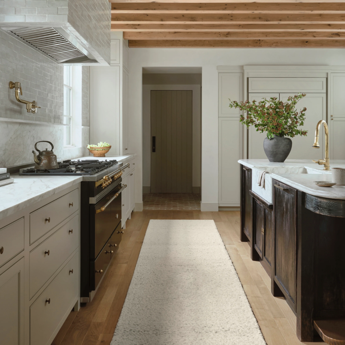
I'm a huge fan of handmade ceramic tiles -- I love how they soften a modern look. No contrast grout here -- we wanted a tonal, fade in the background grout that would highlight the rough edges of the tile. One of the first things my client said is that she didn't want an all white kitchen. With 8' ceilings, I felt it was important to keep the tile light and bright without contributing to the all white kitchen movement. The vertical tile layout draws your eye up and makes the kitchen feel taller than it is. This black marble-look quartz is super durable, scratch resistant with a modern edge.
The stained glass panels are a beautiful, sentimental design feature that we wanted to honor and complement. This is a space that the homeowners entertain in -- the offset island provides a comfortable place in the kitchen out of the prep area to chat with girlfriends. It’s also a space that opens up to the living room for easy entertaining.

Another design element that we took into consideration when designing this space was the contemporary barn door from the original kitchen. We had lots of wood tones to work with and opted to pair the black quartz with a walnut-like stain on the floating shelves...not to mention the beautiful light hardwood floors. The kitchen furniture was a domino effect -- the Cisco Brothers x John Derian sofa was a comfortable, functional statement piece. When trying to think of what wood tone to source a dining table in, we opted to do something alternative and introduce a hammered metal table that would be easy to tuck several chairs under!

We wanted to maximize every precious square foot of floorspace in this kitchen. The homeowners were so used to feeling cramped and confined that I wanted to make sure we were smart with our kitchen seating. Before, they had a counterheight table with four stools. It was challenging to walk around the table in the original kitchen configuration. For the new layout, combining a six foot sofa with a 42" bistro table, we eliminated the need to walk all the way around the table and could tuck it by the window. The sofa seats 2-3 people and you can pull up 3 more chairs.
We were so thrilled to be the designer on this project — we partnered with Gitt Construction. Stay tuned for the finalized space!


